01
Arrivalالوصول
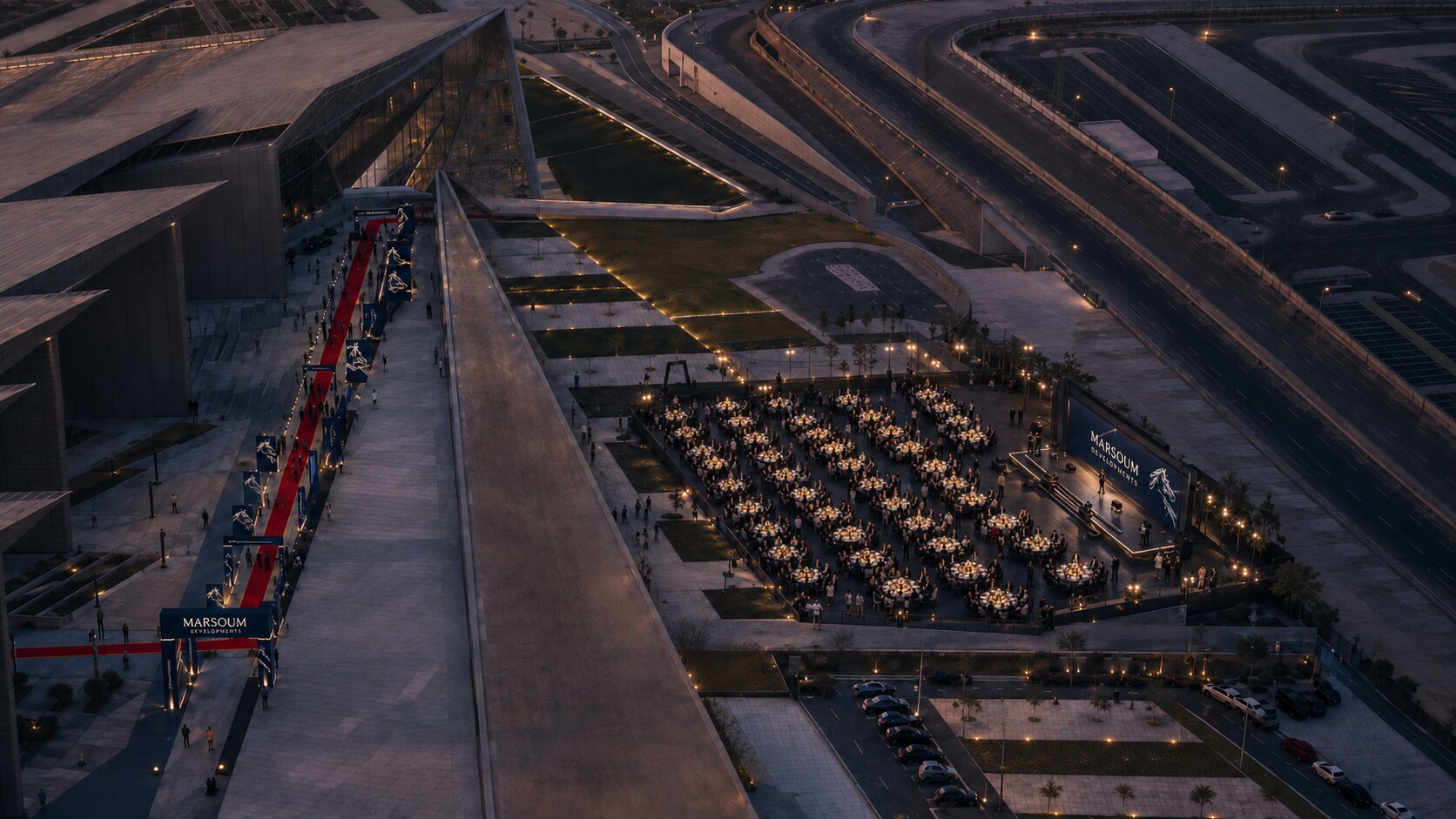
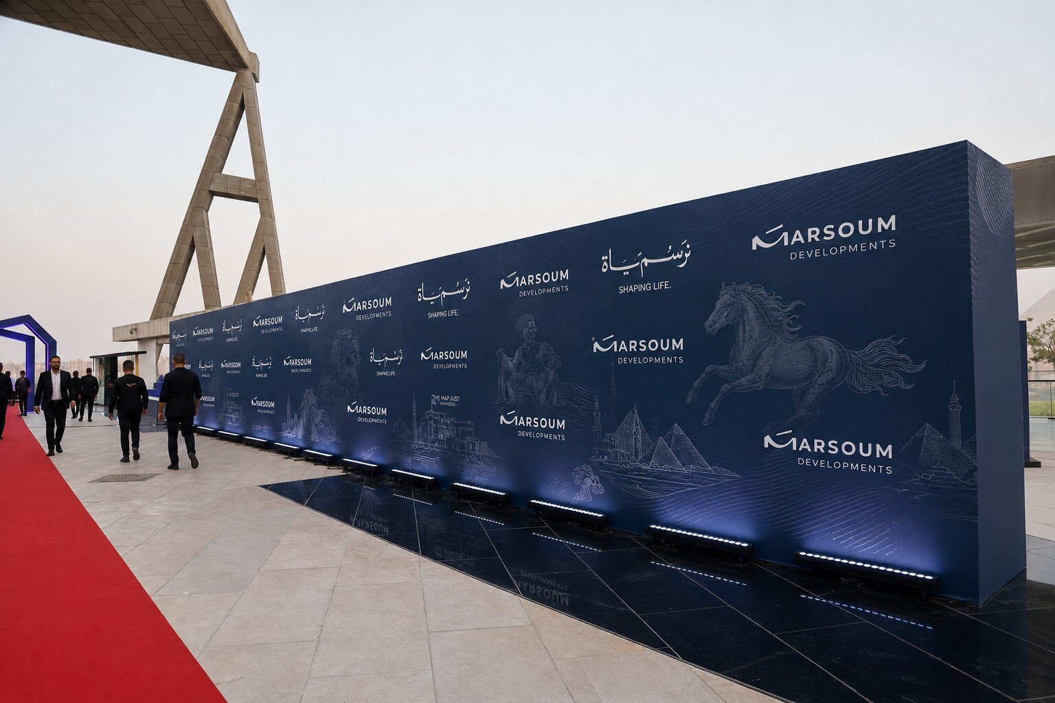
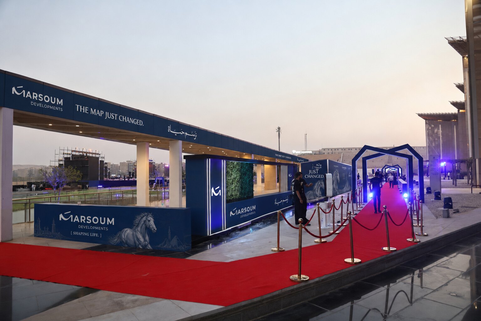
Branded valet. Monumental steel arch. 300m red carpet corridor. The first hero moment.
Strike Media Presents
نرسم المستقبل
Marsoum Developments
The Brief
حفل إطلاق راقٍ لمشروع مرسوم للتطوير العقاري، على شرفة المتحف المصري الكبير في الهواء الطلق أمام الأهرامات، لـ ١٥٠٠ ضيف مدعو في ليلة ٨ سبتمبر ٢٠٢٦.
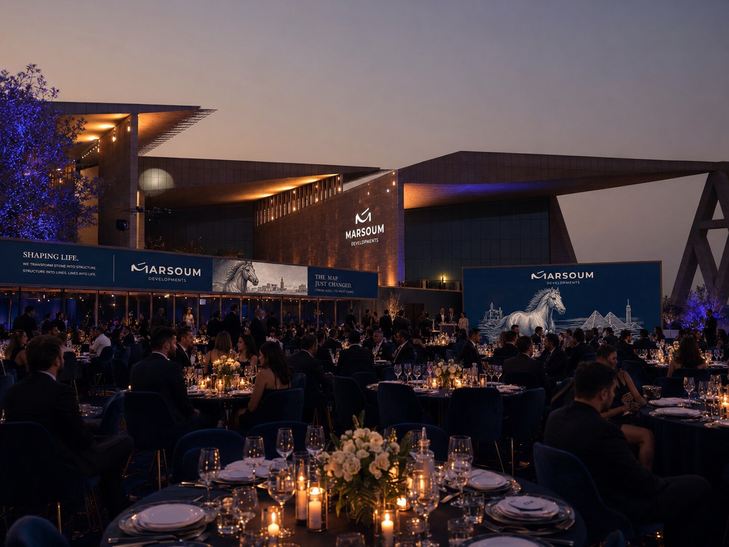
The Venue
Fine Dining Terrace · Giza
الوجهة الأكثر أيقونية في مصر — شرفة فاخرة بمساحة ١٢٫٥٠٠ متر مربع تطلّ مباشرة على الأهرامات. لا مكان آخر يحمل هذا الثقل الحضاري.
The only venue in Egypt where your launch event is witnessed by 5,000 years of civilization. The Grand Egyptian Museum Fine Dining Terrace is not a backdrop — it is the statement.
The Concept
نرسم المستقبل
مفهوم يجمع بين عمق الموروث وطموح المستقبل في ليلة واحدة لا تُنسى.
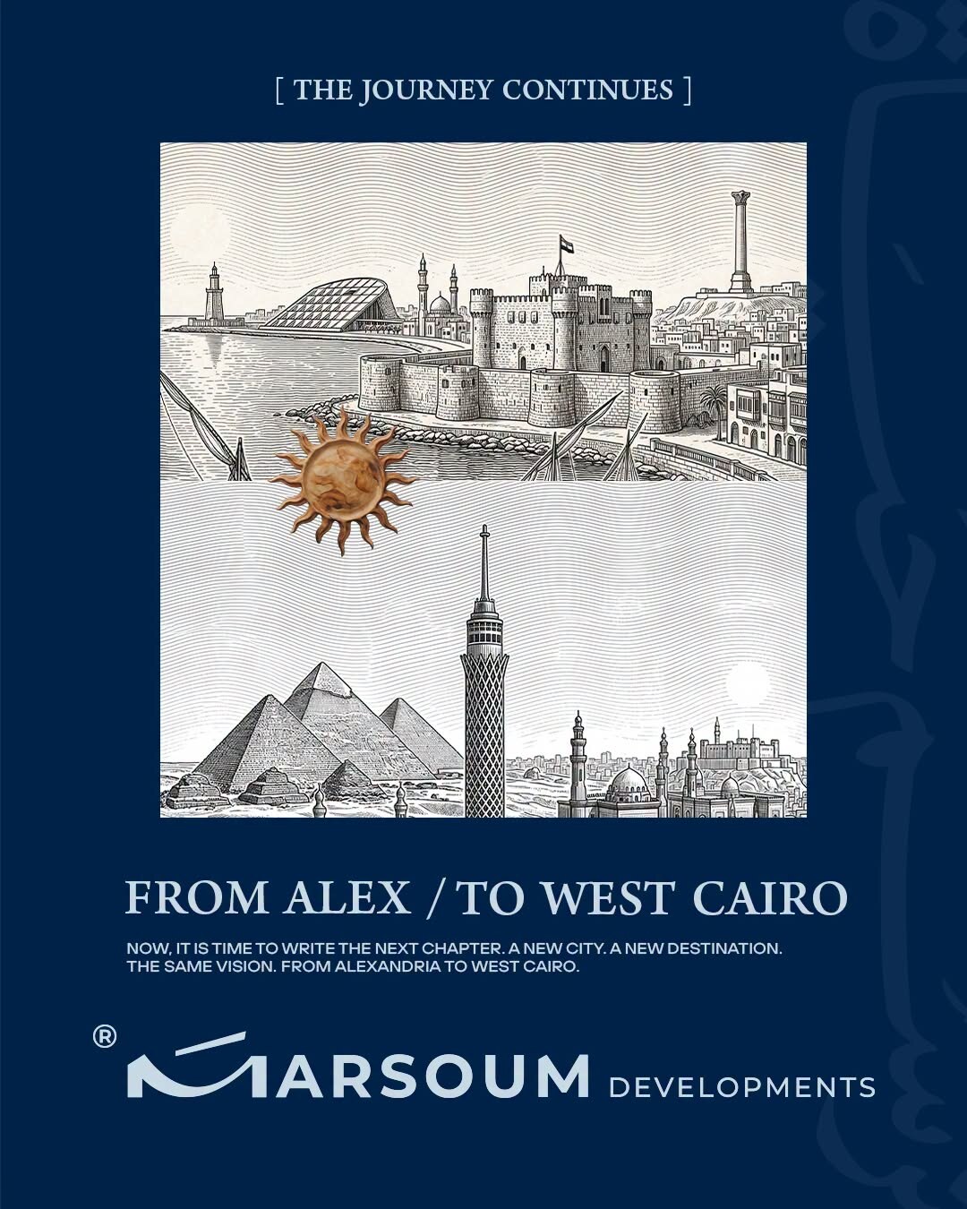
The Experience
أربع محطات متكاملة تصنع ليلة لا تُنسى: الوصول الاحتفالي، التجوال بين الإبداعات، لحظة الكشف الكبرى، واللحظة التي يُروى عنها.
Four acts. One unforgettable night.
Branded valet. Monumental steel arch. 300m red carpet corridor. The first hero moment.
Registration desks. Living Map floor projection. Live engraving artist. Arabian horse photo moment. Signature perfume bar.
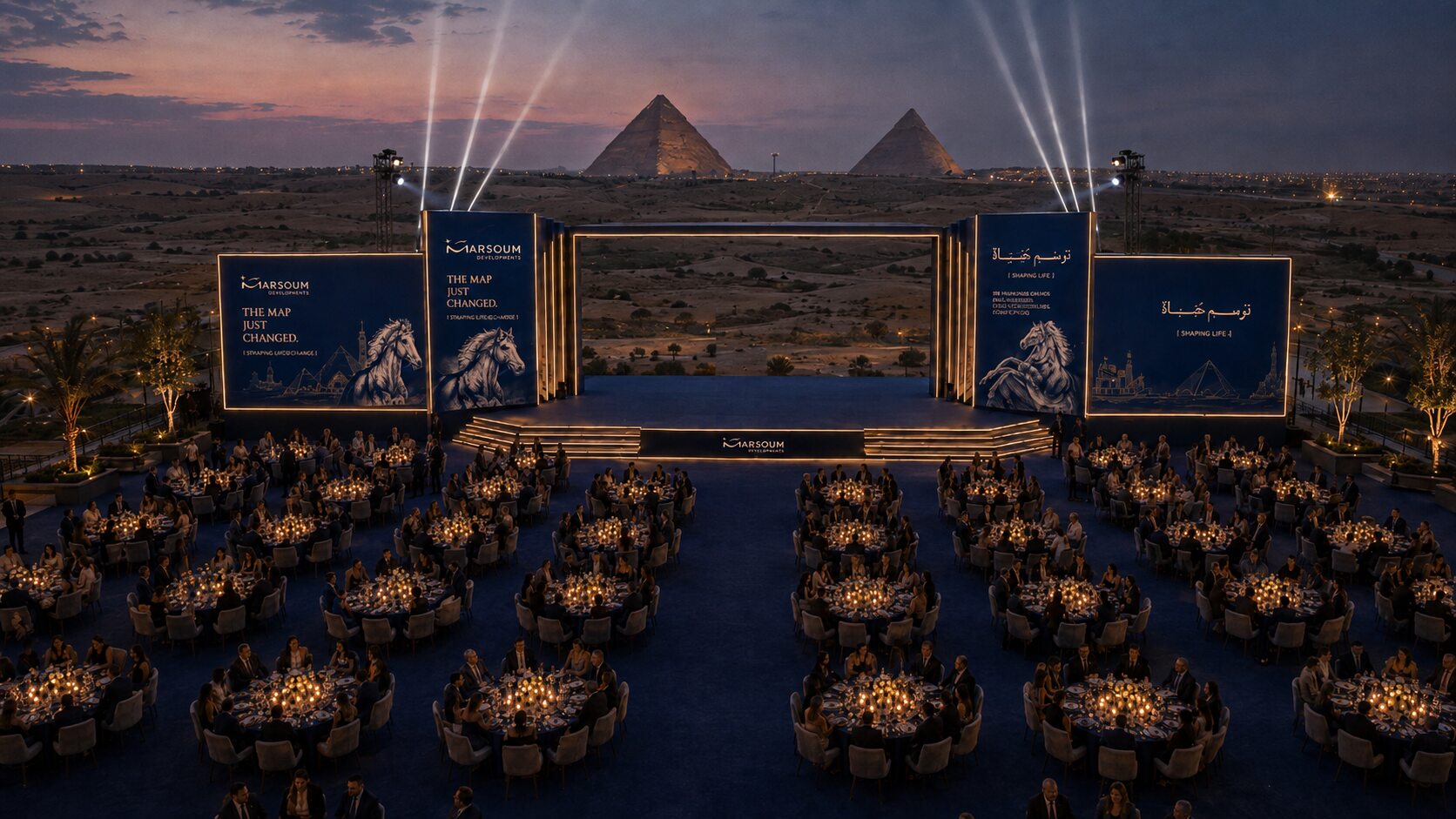
Terrace opens. Full scale hits. Pyramids on the horizon. 1,500 tables in navy and gold.
CEO on stage. Project unveiled. Heritage orchestra. The headliner. The night remembered.
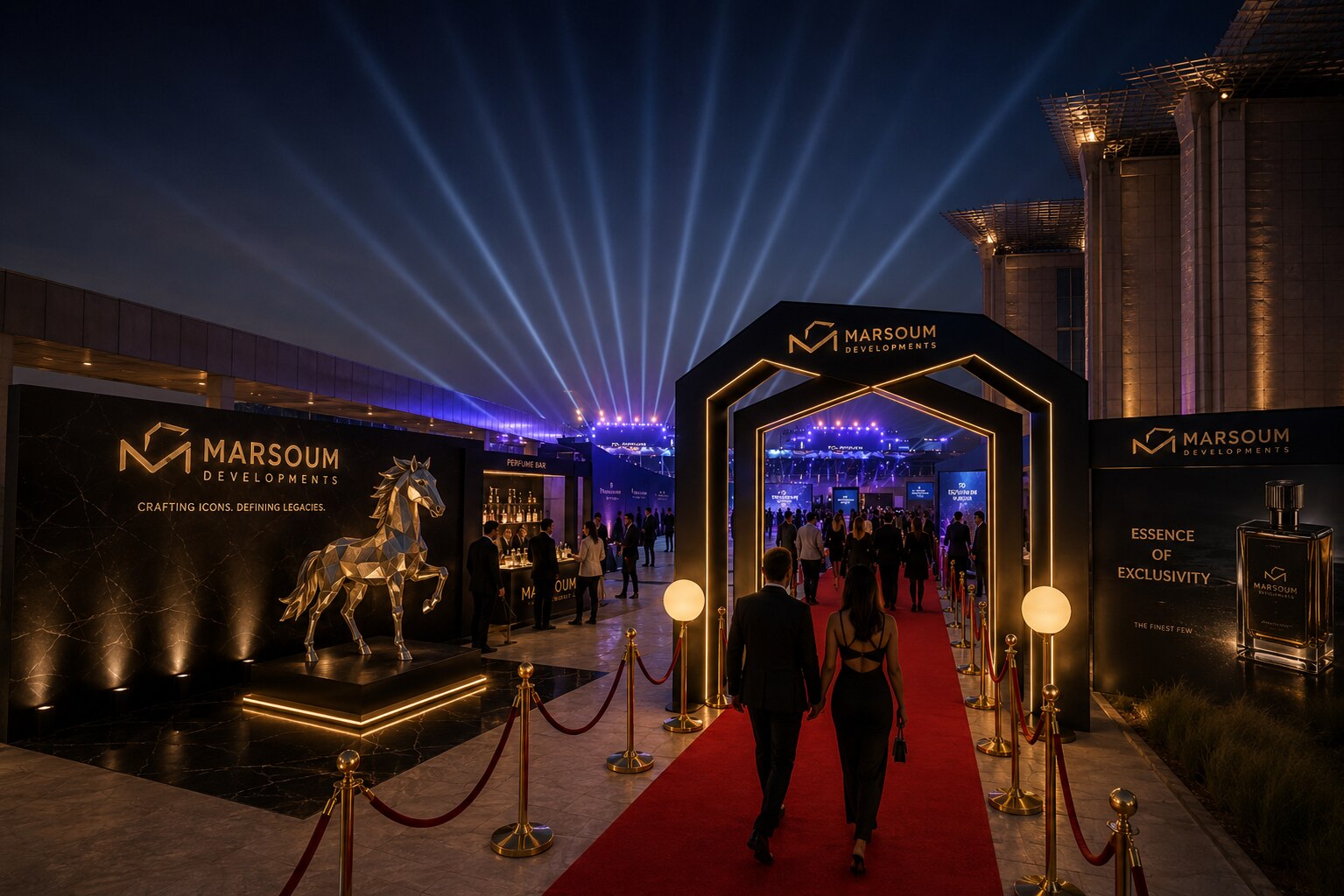
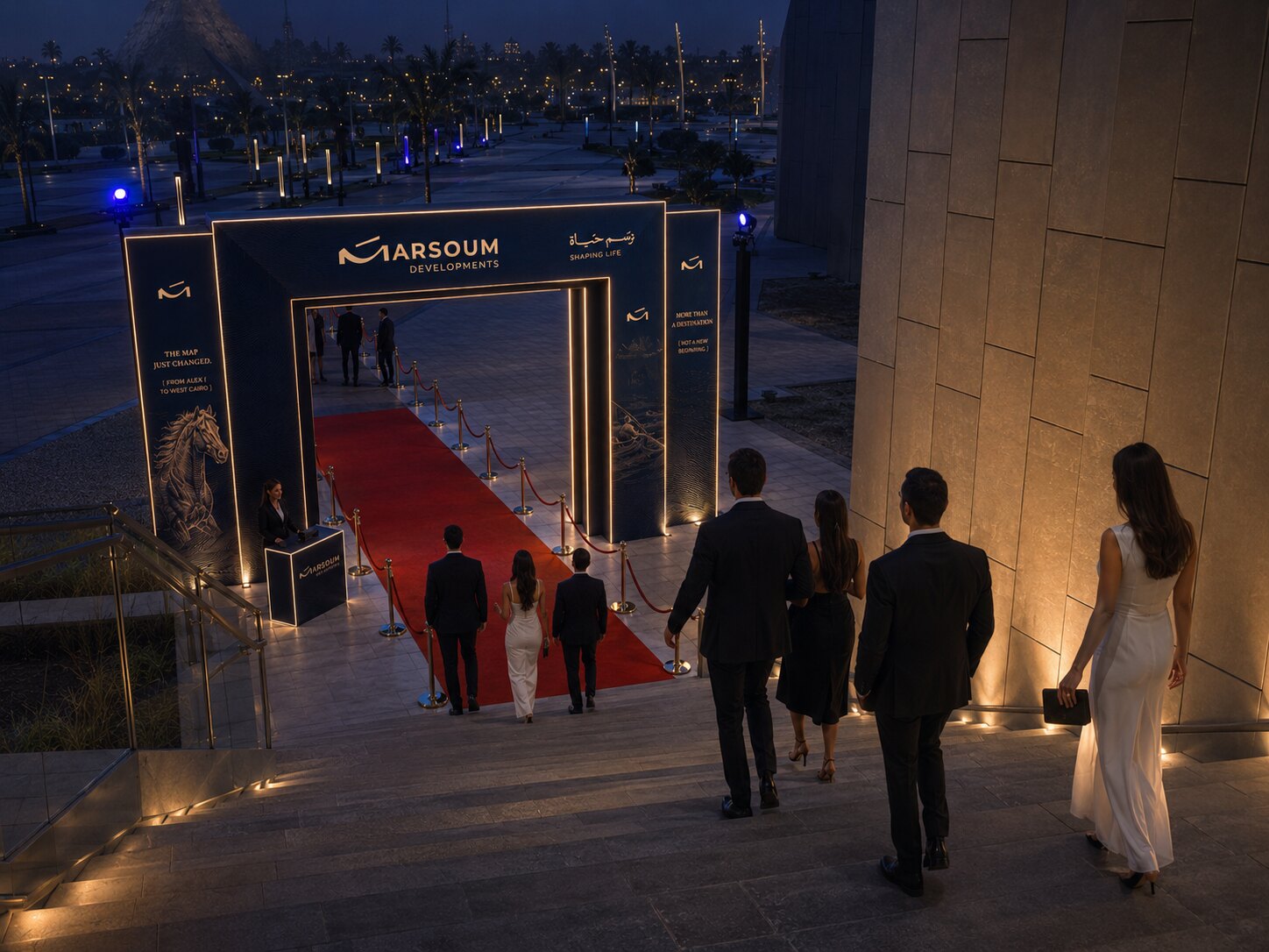
Act 1 · Arrival
استقبال ملكي: ممشى أحمر بطول ٣٠٠ متر، بوابة ضخمة بنقش ذهبي، وموسيقى عود عربية تستقبل كل ضيف.
Four activations engineered to be photographed, shared, and remembered.
أربع محطات تفاعلية مصممة للمشاركة والتوثيق: خريطة مصر المضيئة، نقّاش حي على الحجر، حصان عربي أصيل في قوس ضخم، وبار عطور بتوقيع مرسوم.
Floor projection of the Egypt map in gold and navy. Guests walk across it. The Instagram moment.
A master artisan hand-engraves guest names on stone tablets in Marsoum style. A keepsake they carry home.
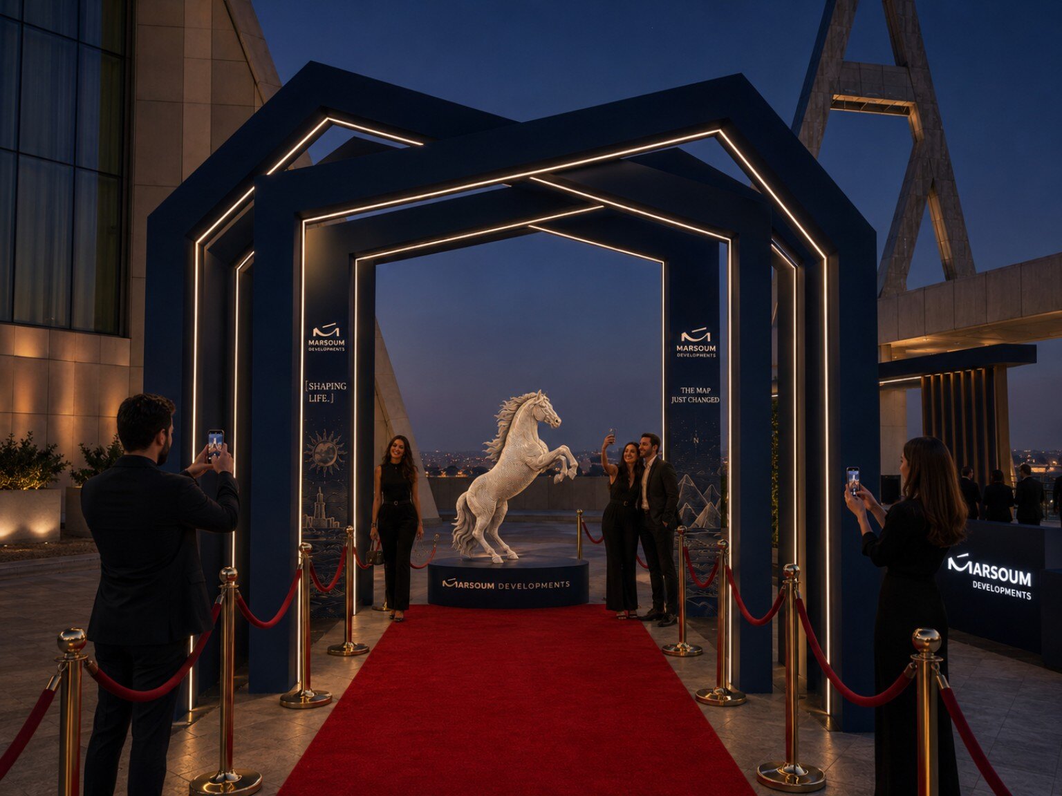
The Marsoum horse — rearing, illuminated — framed in a monumental navy arch. The brand motif guests photograph and carry home.
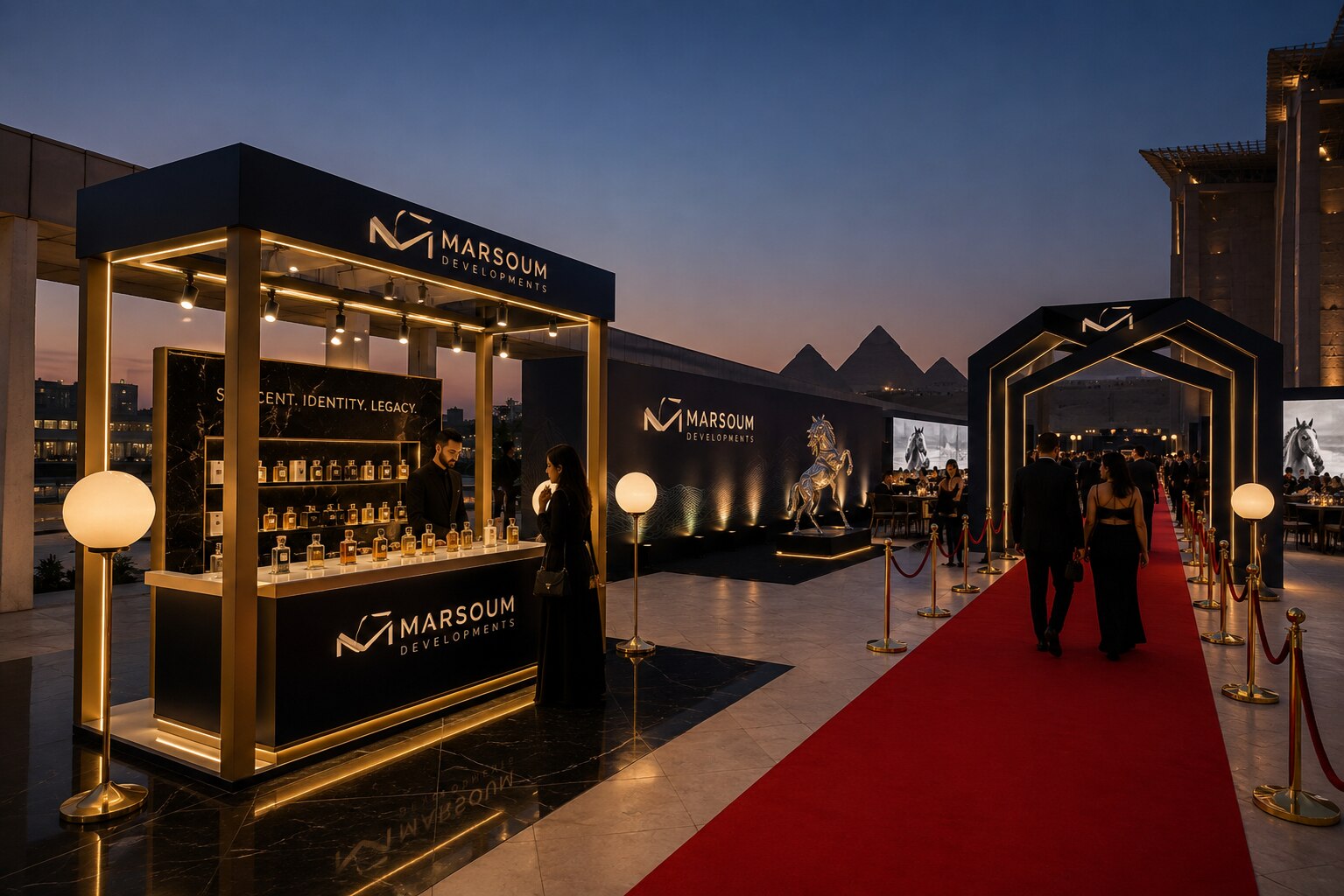
A glass-and-gold cabinet of signature scents — "Scent · Identity · Legacy." Guests choose and take a bottle. The brand they carry home in every sense.
Acts 3 & 4
تنفتح أبواب التراس على ١٢٫٥٠٠ متر مربع من الضوء والأهرامات في الأفق. لحظة الصمت تلك هي قصد المصمم بالضبط.
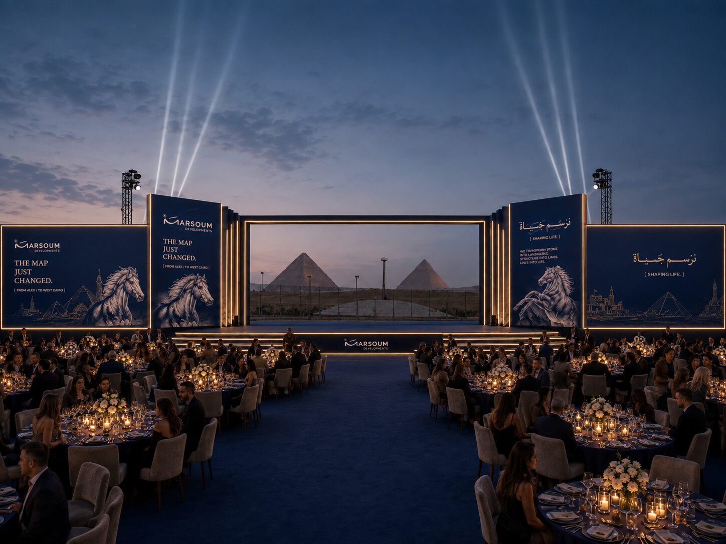
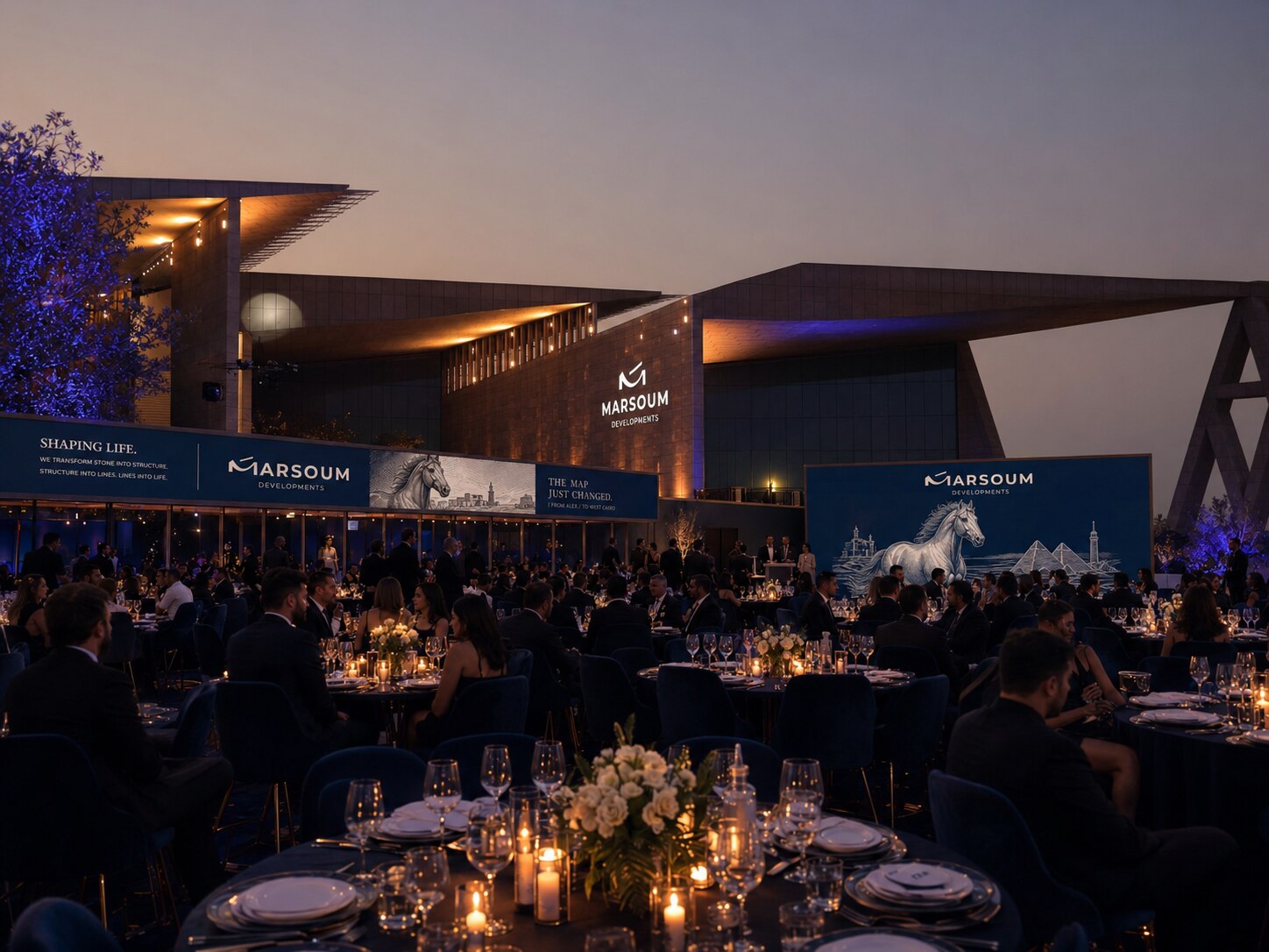
The terrace doors open and the full scale of the night lands at once — 12,500 square metres of illuminated stone, the horizon opening onto the Pyramids, 150 tables dressed in navy and gold falling away toward the light. Conversation stops. That silence is the design intent.
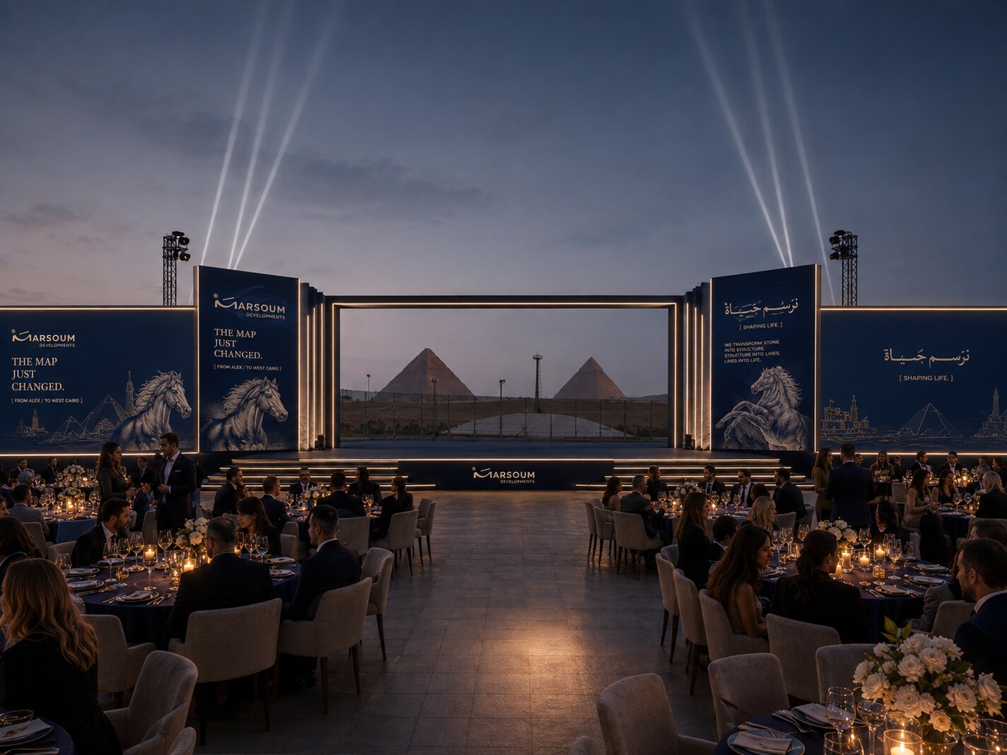
The CEO takes the stage and the project is unveiled against 5,000 years of skyline. Dinner follows in five-star service. The heritage orchestra gives way to the headliner, and the last frame of the night is a stage, a crowd, and the Pyramids behind them.
Spatial Design
Every square metre accounted for.
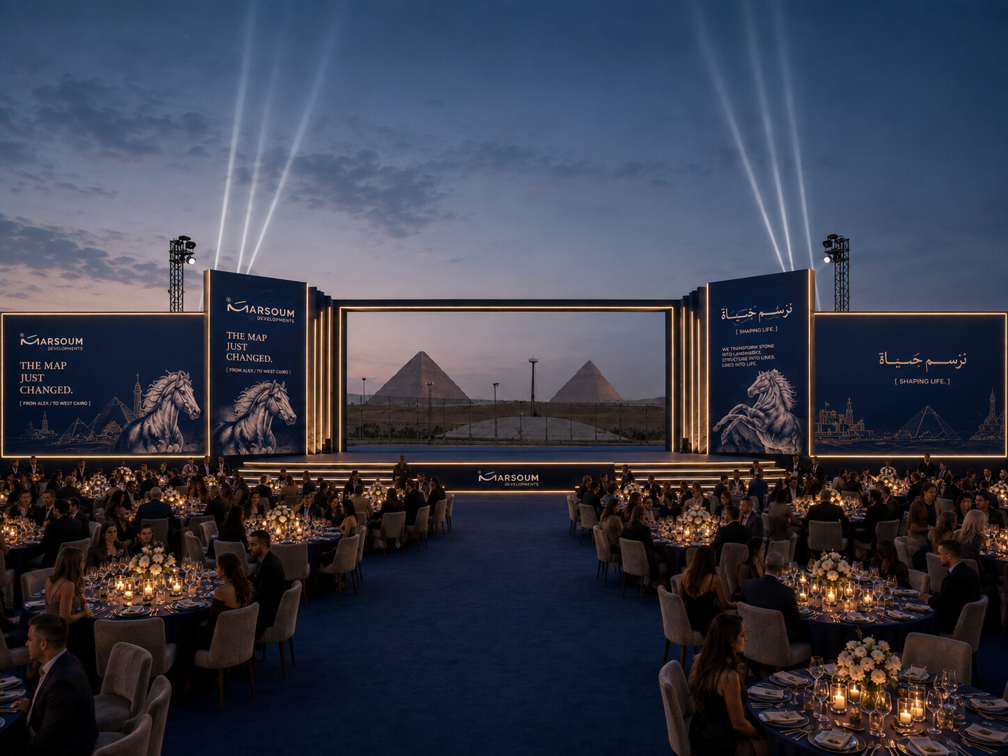
١٥٠ طاولة مستديرة لعشرة أشخاص، منطقة VIP مستقلة بخدمة كاملة، ومسرح بعرض ٢٠ متراً في مواجهة الأهرامات مباشرة.
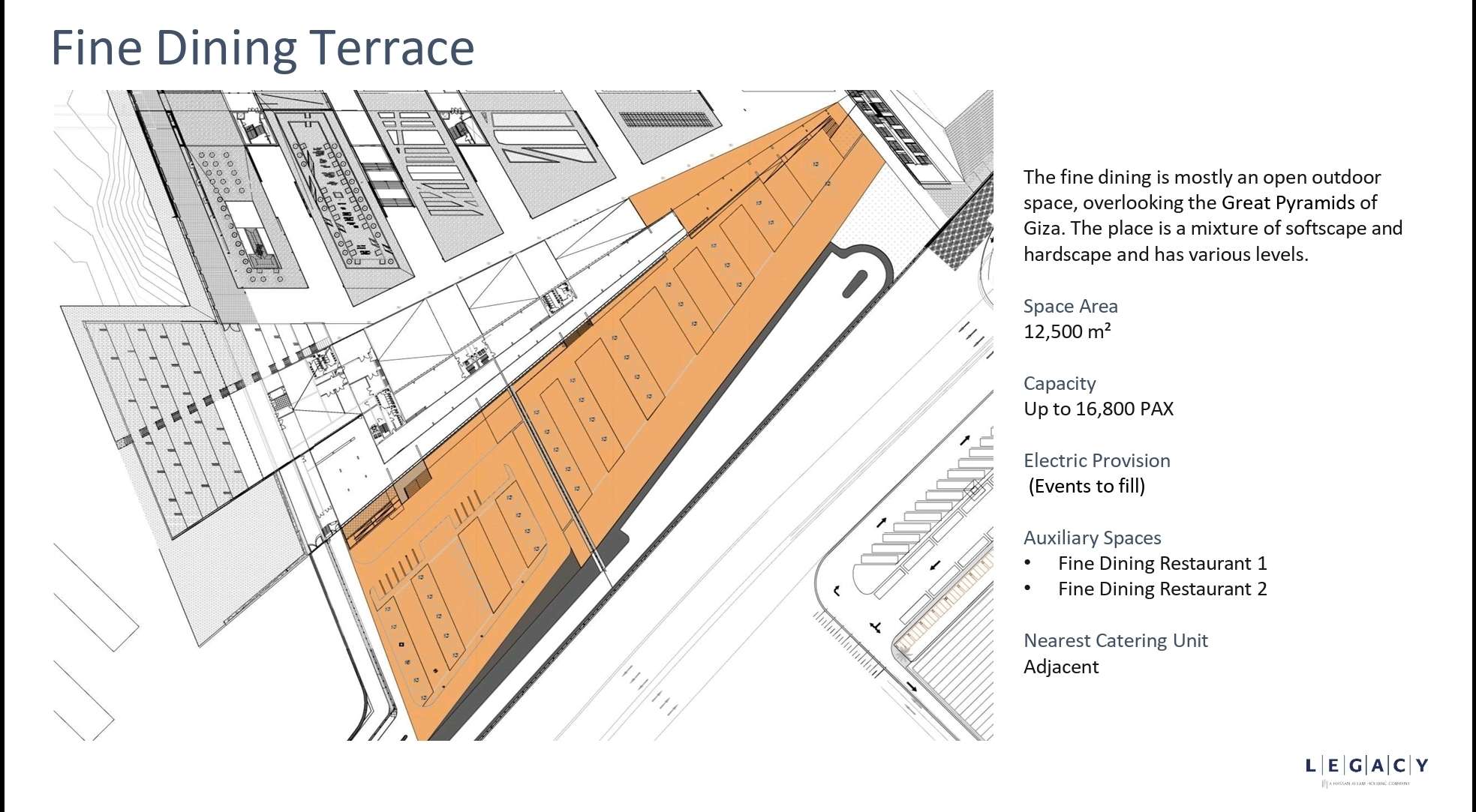
Bird's-eye · GEM Terrace · Marsoum Event at Scale
Stage Design
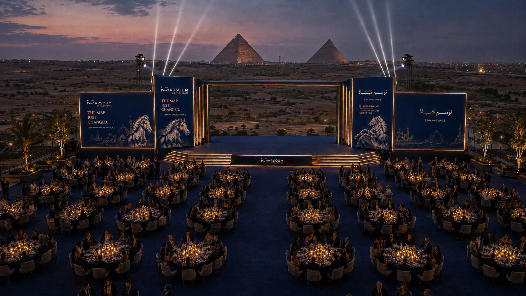
A 20m × 8m stage facing the three Pyramids of Giza — built for 1,500 guests and a headlining night.
Entertainment
Three tiers. One rising arc.
ثلاثة مستويات من الترفيه تتصاعد في حدّتها: موسيقى تراثية، عروض فنية حية، وختام ساهر بنجم عربي يُغلق ليلة لا تُنسى.
Entertainment Options
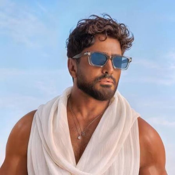
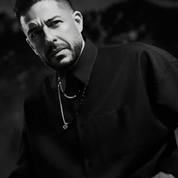
Six calibres — one night. Strike Media manages all negotiations and contracts.
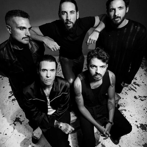
ستة خيارات من ألمع نجوم مصر والعالم العربي — ستريك ميديا تتولى التفاوض والعقود من أوّلها لآخرها.



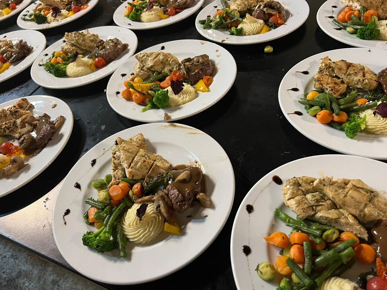
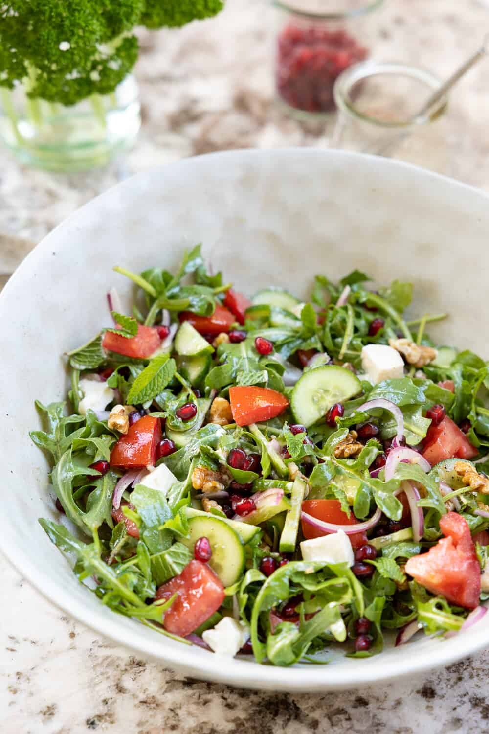
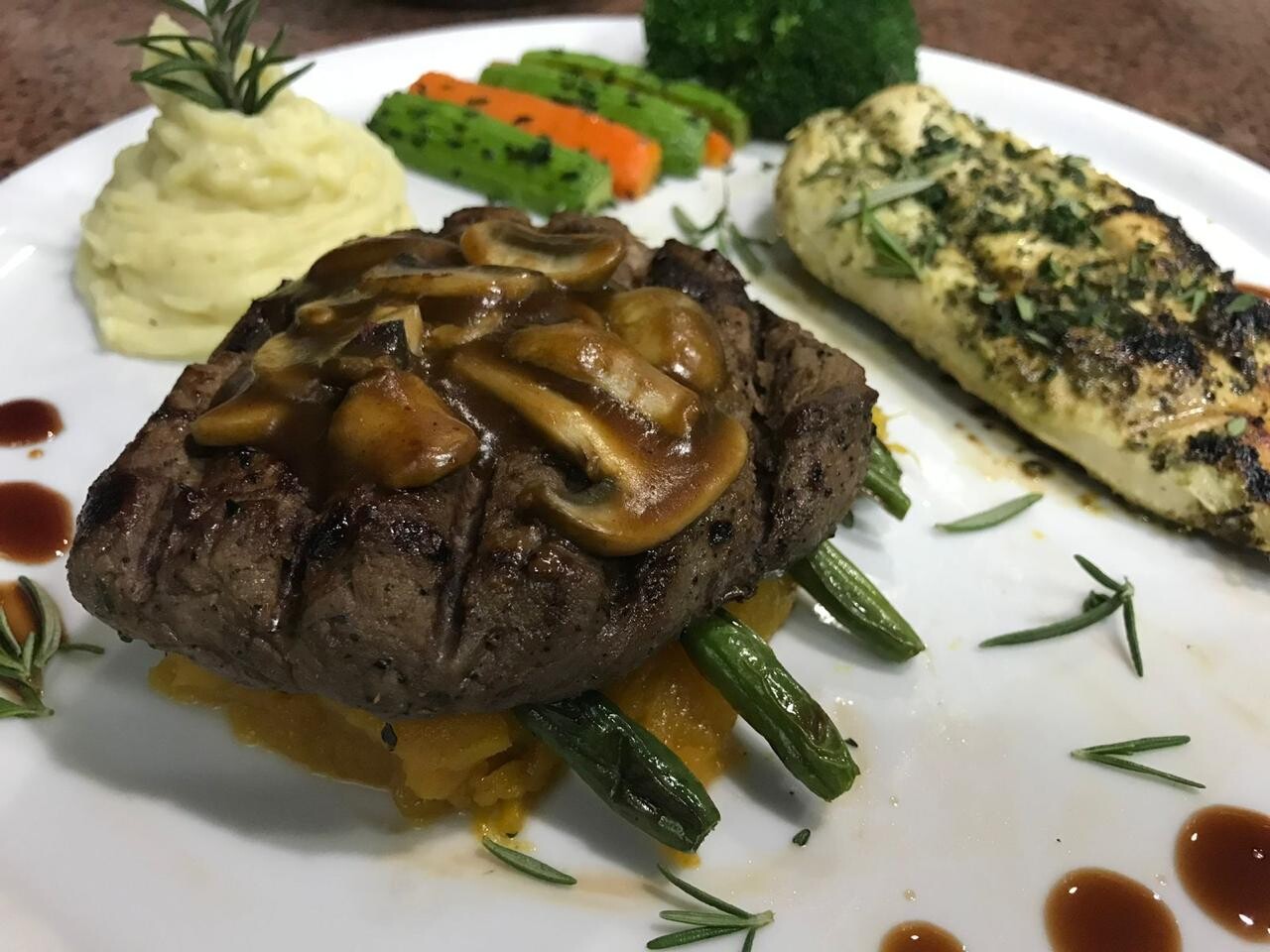
تجربة طعام بمعايير فنادق الخمس نجوم — من مقبلات البحر المتوسط إلى الطبق الرئيسي العربي وصولاً إلى الحلوى المصرية الأصيلة.
On Stage
Four seasoned voices guiding the evening from welcome to close.
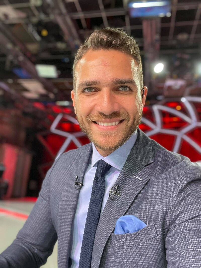
Master of Ceremony

Master of Ceremony

Master of Ceremony
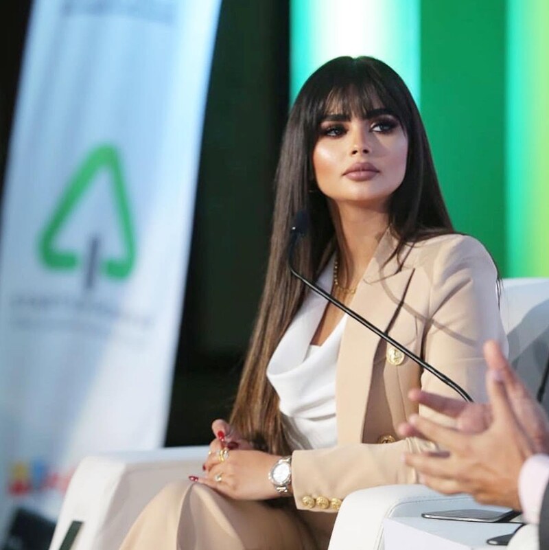
Master of Ceremony
Dining Experience
A curated gala dinner — executed by one of Egypt's finest catering houses.
Event Day
من الاستقبال عند السادسة مساءً حتى ختام الليلة — جدول زمني محكم يضمن تدفقاً سلساً لكل لحظة من الحدث.
From venue takeover to valet retrieval.
"The map just changed. This is where the new one begins." — Marsoum Developments
Proven Execution
سجل حافل بأحداث من هذا الحجم والمستوى. ستريك ميديا نفّذت فعاليات مماثلة في نفس المكان وتعرف بدقة ما يتطلبه الحدث الاستثنائي.
The scale. The venue. The production — already delivered.
Marsoum's event presence is already legendary — the GEM night will be the pinnacle.
Why Strike Media
فريق ستريك ميديا للإعلان والعلاقات العامة — أصحاب الخبرة في أكبر أحداث مصر وأكثرها أثراً وتأثيراً.

“The map just changed. This is where the new one begins to be drawn.”
نرسم المستقبل